Design Lessons on Colors
As an interior designer, I am asked most frequently about paint and paint colors. Picking paint colors for your home can be daunting. I like to have different colors for each room. The upside is that each room’s theme and style will fit the paint color perfectly. The downside is that it’s messy and not finished fast enough. Especially if you are just moving into a new home, you want to get the whole house painted all at once. My advice is to resist impatience. You will be living with the colors a long time. Here are my tricks:
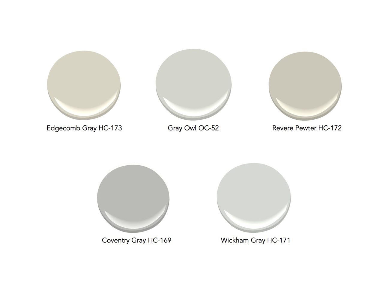
Design Lesson 1: Pick “Neutral Gray” for Common Space
In my book, “Neutral Gray” is a mid-tone and soft color you wouldn’t get tired of quickly. I tested this theory myself; I wanted to see if I could tolerate a more saturated color in my own living room. I painted the walls a saturated reddish color. Please learn from my mistake! I had to repaint the walls in a neutral gray in less than a week. Neutral gray means a tone that is technically about halfway between black and white. My art teacher used to make us create neutral grays by mixing complementary colors. Gray, then, can be made not just from black and white, but also from other primary colors. Gray can have blue or blush tone, or may have many other tones in it. Pick a mid-tone color that will not be in your face, and in a family of color that you love. Here are some of my favorite Benjamin Moore neutral grays:
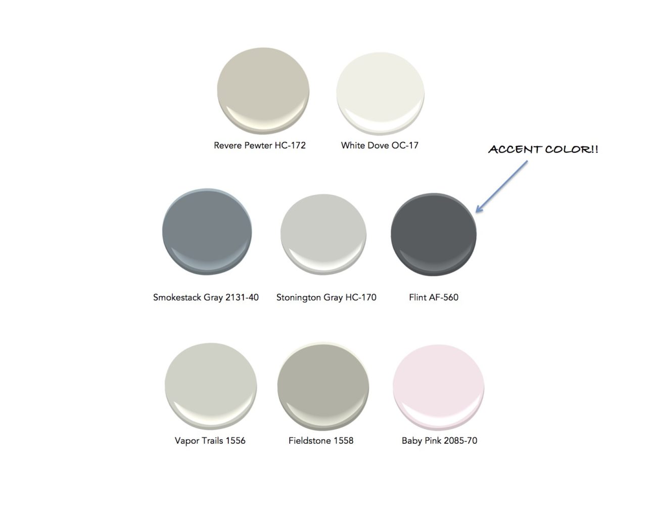
Design Lesson 2: Select 5-7 Harmonious Colors Throughout Your Home.
I usually like to pick 5-7 different colors for an entire house. The trick is to pick colors with similar values for the entire house. It is fine to have one or two accent walls that are darker than the rest, with an intention. In general, however, if you pick one that is too dark, it will jump out at you and will not go together harmoniously with the other colors in the home. Here is an example. You see all the colors working together in the example below.
 Design Lesson 3: Negative Space. It’s All About the Balancing Act.
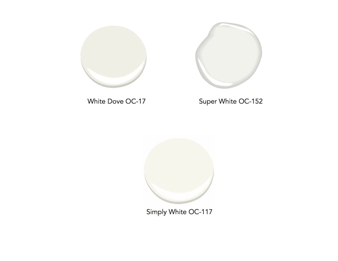
If you have colored space, you need negative space. Negative space often means “white space” in my color world. Negative space often becomes white ceilings, trims, and doors. Because of this, the colored walls pop and have boundaries. When walls are all white, the opposite happens. It brings balance to a composition. Colors are difficult and whites have so many shades…but here are some of my favorite Benjamin Moore whites you can easily copy:
Interior design is all about expressing yourself through your surroundings, and creating a living space that nurtures your spirit. To pick colors, ask yourself how you want to feel in a certain room, day after day. Pick the colors that express that. If you plan to remodel, ask yourself how changing the colors might soothe or energize you better than the colors you now have. Have a wonderful, colorful day!
*Featured image credit: Yoko Oda Interior Design, LLC